
My family hosted a Spanish exchange student for a week in the fall of 1987, on behalf of our high school's Spanish department and my sister, who was a junior that year. I don't remember the exchange student's name, but she was 16, from Barcelona, and extremely cute. Also, her accent was amazing. Her grasp of the English language was limited, of course, and I couldn't yet speak a word of Spanish (though that would be my foreign language of choice when I began studying it the following year), so we didn't really talk to each other. Plus, I was only a freshman (which, when you're that young, means I might as well have been a toddler as far as she was concerned).
However, on the second or third afternoon of her stay with us, my sister told me that the exchange student (I wish I could remember her name!) liked to read English-language comic books to help her learn the language, and did I have any that she could borrow?
I remember perceiving this request as a golden opportunity. An opportunity for what, though, I wasn't quite sure. To impress her? To start a conversation? An international love affair? Ultimately, being a shy kid, I simply hoped for the first possibility and gave my sister a handful of comics to lend to her new Spanish friend.
I don't remember all of the comics I gave to her to read,
1 but I vividly recall that
The Punisher issue 4 (which had just been published) was one of them. I suppose, at the age of 14, I believed that the Punisher was the kind of character that a more grown-up kid would like, and would thus prove to the exchange student how mature I was.
[At this juncture, please feel free to roll your eyes and/or make a sympathetic pity face for my 14-year-old self's benefit.]
It goes without saying that an assault-rifle-toting paramilitary vigilante with a giant skull painted on his chest is not likely to appeal to a 16-year-old girl from Barcelona (or from anywhere, really). And rather than revealing my "true nature" as a mature young man (or maybe "cool" is what I was going for, whatever that ill-defined quality means to a 14-year-old), this issue more likely gave her the impression that I was a weird little creep with a gun fetish who regularly shoplifted copies of
Soldier of Fortune magazine from the drugstore and played cowboys and indians with his friends.
2 Did I understand girls at all when I was 14? No, clearly, I did not.
Regardless, the exchange student was mute on her appraisal of the comics I lent to her. I never heard what she thought about them; they were returned to me, without comment except for a beautifully accented "Thank you," at the end of her stay with us. Before she left she gave me a yellow 1992 Barcelona Olympics T-shirt,
3 which I loved and wore at least once a week for years until it disappeared--not long before the Olympics actually took place in Barcelona in '92, ironically enough.
4
This was the first and only time I'd give comic books to a girl to read--until seven years later, when I was a senior in college and my girlfriend read my copy of Alan Moore's
Watchmen to prepare herself for reading my senior honors thesis (on Hegelian notions of identity explored in the characters of Rorschach and Doctor Manhattan, among others).
5 But that's a story for another post.
Pointless Footnotes
1 In the fall of 1987 I was regularly reading
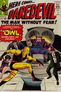
G.I. Joe, X-Factor, The 'Nam, Daredevil, The Silver Surfer, and
The Punisher, so it would have been some combination of those--but mostly
Daredevil and
X-Factor, I'm guessing.
2 For the record, I neither was nor did any of these things.
3 The International Olympic Committee had selected Barcelona as the host of the '92 Olympics in the fall of 1986.
4 Another clothing-related detail I recall: While she was here she bought a bunch of Levi's jeans to give to her friends back home because, apparently, Levi's were really expensive in Europe in the '80s.
5 See particularly Georg Wilhelm Friedrich Hegel,
The Phenomenology of Spirit (Oxford, UK: Oxford University Press, 1976) and Martin Heidegger,
Identity and Difference (New York: Harper & Row, 1969).
 Whenever I went to the grocery store with my mom, it was usually so I could browse the magazine and comic book racks while she did the shopping. In the early '80s, I was looking for the newest Archie digests. In the late '80s, I had begun reading other types of comics. One cold day in early 1987, I was browsing the racks and had picked out a book for myself, probably the latest G.I. Joe, X-Factor, or Daredevil, and sweetly asked my mom to buy it for me (these grocery store trips, you see, were how I supplemented my allowance-purchased comic books). She agreed, but asked me to pick out something for my brother too, because our mother is nothing if not fair.
 In 1986 my allowance didn't amount to much. I recall earning maybe two or three dollars a week for yardwork and various chores around the house. So I had to choose my comic book purchases judiciously, especially since I also spent my money on books and records. Fortunately,
  This comic book was a hand-me-down. Sometime in the late '70s or early '80s (I don't remember exactly when), during one of the vacations my family took to a lake in Wisconsin with my dad's brother's family, my cousin Scott gave this comic book to me. He's a few years older than me, so when I was only seven or eight years old, he seemed impossibly cool and grown-up. This was my first Archie comic book.

 You may have noticed I've not had much to say about the specific content of the books I've been discussing thus far. If so, congratulations! You have hit upon a very important point: namely, that my understanding of quality with regard to story and art was still, at the age of 13, somewhat underdeveloped. Larry Hama's G.I. Joe scripts were adequately compelling in the way that soap operas and other serials are compelling, and you could, for the most part, tell his characters apart from one another without having to resort to looking at their uniforms. Likewise, Rod Whigham's pencils (among many others') illustrated the characters and, perhaps more importantly, the military hardware and vehicles with workmanlike precision, but without anything that my young teenage mind would identify as artistic self-expression. In other words, if you asked me to distinguish Whigham's pencils from those of fellow Joe pencilers Mike Vosberg or Frank Springer--or even Herb Trimpe--I wouldn't have been able to do it.
 Enter Michael Golden. In the G.I. Joe Yearbook 2, Golden penciled the book's one story, about the Joes' Soviet doppelgängers, the Oktober Guard, battling Cobra forces. The story itself involves Cobra laying a trap for the Oktober Guard to steal their new laser cannon, which they're field testing on some Afghan rebels, blah blah blah. It's no more interesting than any other story in G.I. Joe, but look at that those camels' faces! Setting aside the fact that they're being slaughtered by some seriously cold-blooded Soviets, those are some beautifully rendered expressions.
 Yet even though Golden's forte is clearly people and faces, you can see from this panel that he could instill the vehicles and weaponry (which were so important to this serial 32-page advertisement for war toys) with just as much life and action as the characters.
 And finally this page, on the left, may be the best drawn page in G.I. Joe's history. Look at the Televipers flying off the HISS tank in the first panel, the Baroness's hair in the second, Daina's little 'x's for eyes after the Baroness clocks her in the third, Daina's revenge in the fourth, and Firefly's bug-eyes in the last panel. Brilliant visual storytelling.
 My parents are "lake people" in the sense that they grew up spending their summers on a lake, and so as I grew up I was a "lake person" too, except that I didn't like it very much. I've never liked swimming, boats aren't that exciting to me, and, because we would go to
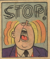
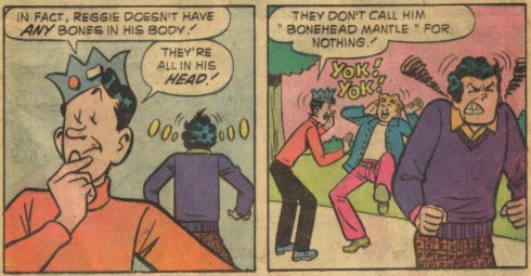
  This issue of Archie is somewhat unusual in that it contains a single, 22-page story (albeit broken up into four parts) rather than a bunch of unrelated six-page stories (the standard length of an Archie story). But the reason this issue is of special note to me is that it was the comic book that tried to prove to me that the comics I got ahold of weren't ever going to be worth much money.